The 2016 Webby Award Winners have been revealed. Winners of the 20th annual Webby Award are honored for being the best of the Internet. A hallmark of the Webby Award Ceremony is that the winners accept their awards with five-word speeches. To honor the tradition, here are three things our favorite winning websites share, in five words each.
Our favorite winning websites have these 3 things in common:
1. Start With the End User
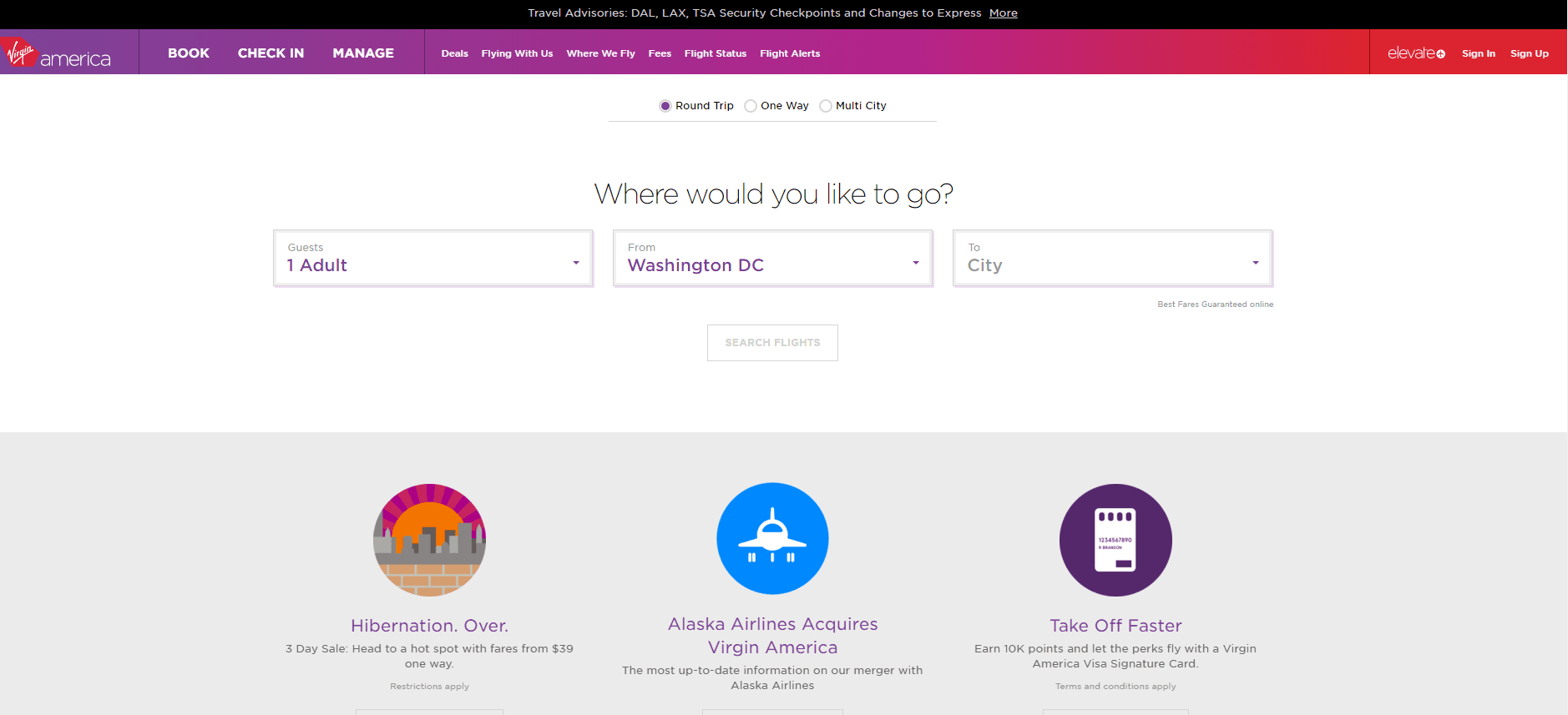
Congratulations to Virgin America, 2016 Webby Winner – Web – Best User Experience
Virgin America’s clean, clutter-free page focuses on the question that probably brought most of the potential customers to the website: “Where would you like to go?” It’s clear the site was designed based on what would bring users to their site, and how they can best provide what users need.
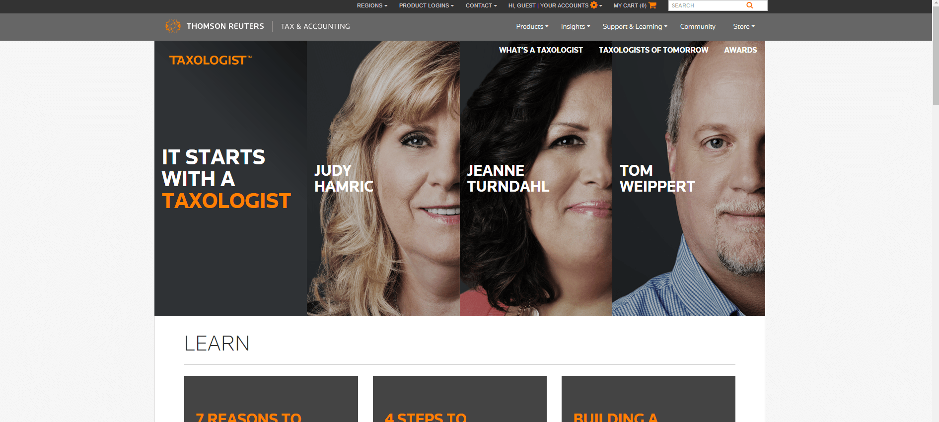
Congratulations to Thompson Reuters Tax & Accounting, 2016 Webby Honoree – Web – Best Business Blog/Website
Thompson Reuters Tax & Accounting Division found a way to make a multinational corporation look personalized. Every element of each page focuses on the user, and answering questions they might have while maintaining a consistent marketing story.
2. Be Memorable With Striking Design
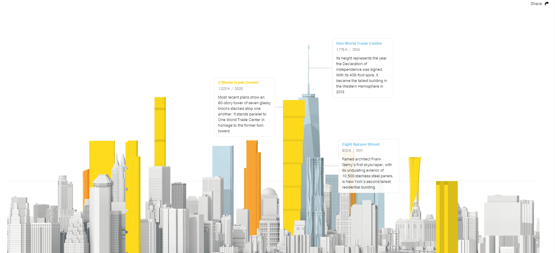
Congratulations to National Geographic: The New New York Skyline – 2016 Webby Winner – People’s Voice – Web – Best Visual Design – Aesthetic
Take a moment to get lost in this site. It’s even better on a mobile device, where you can scroll left to see which Lower Manhattan New York Skyline buildings have been built recently, which are under construction, and which are proposed. Touching the building gets you its history. You’re looking at a stunning, memorable design for an informational website.
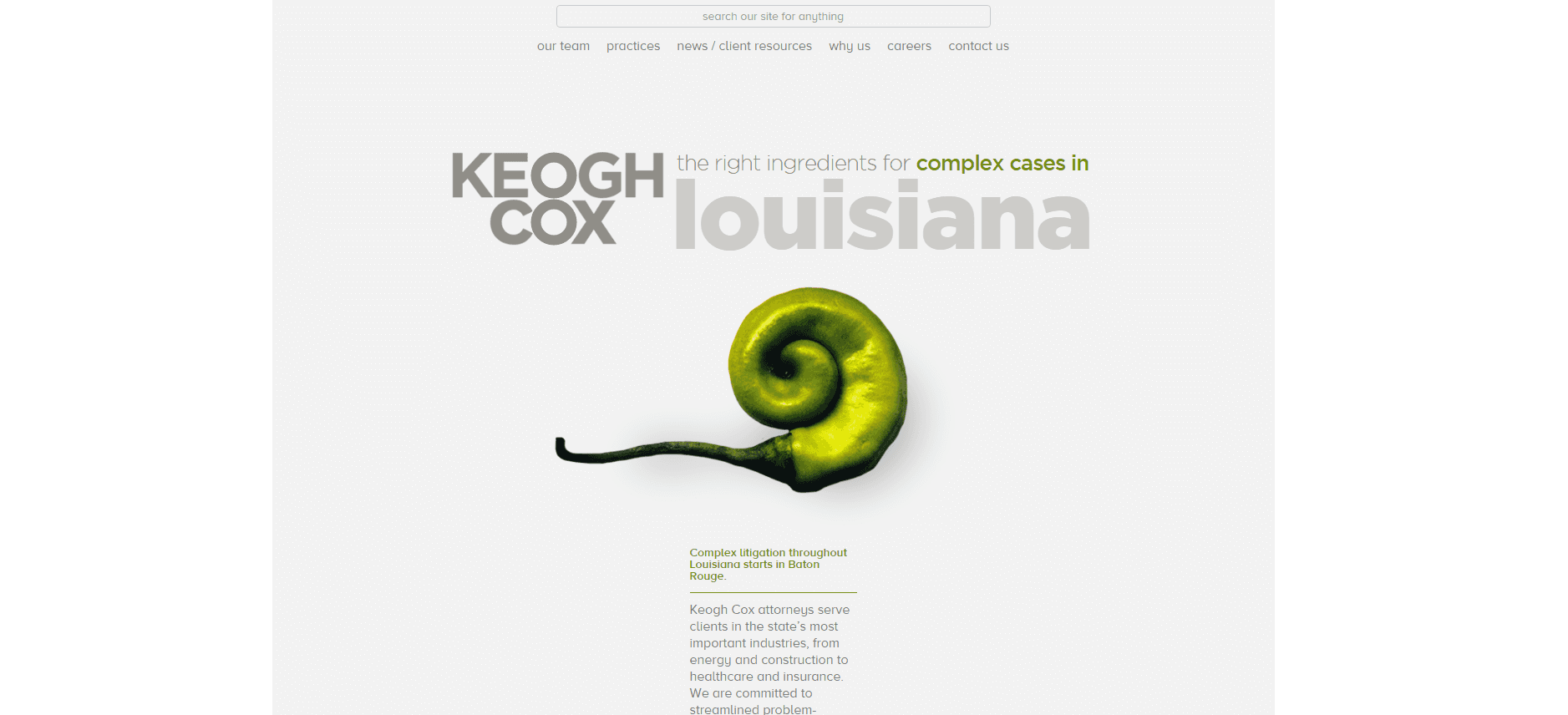
Congratulations to Keogh Cox – 2016 Webby Honoree – Web – Law
How many law firms are bold enough to make vegetables the main image on their site? When you’re a law firm from Louisiana, and your tagline is “the right ingredients for complex cases,” focusing on creole cuisine ingredients is an attention getting, relevant choice. It’s hard to imagine a law firm could make itself look any more modern and tied to the local community.
3. Use Video Like Harry Potter
Remember the pictures in the “Daily Prophet,” Harry Potter’s wizarding world newspaper? The people in the images all moved while the user looked at them. Cutting edge websites are incorporating more and more video with subtle movements, as J.K. Rowling imagined. Click on the pictures to open the websites in a new tab so you can see the videos in motion.
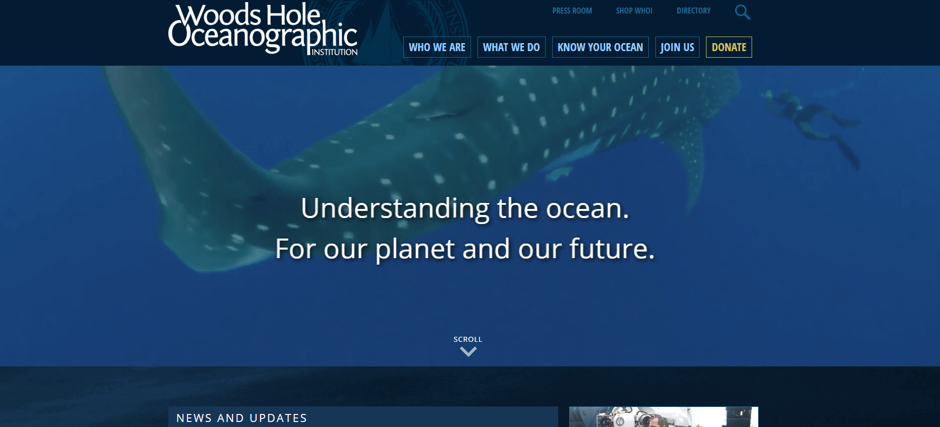
Congratulations to Woods Hole Oceanographic Institute, 2016 Webby Honoree – Web – Charitable Organizations/Non-Profit
This non-profit website uses a compelling video showing themselves in action, with the sound off. Using video as the website’s main image gets the message across about who they are much more effectively than if they had set up a series of scrolling images.
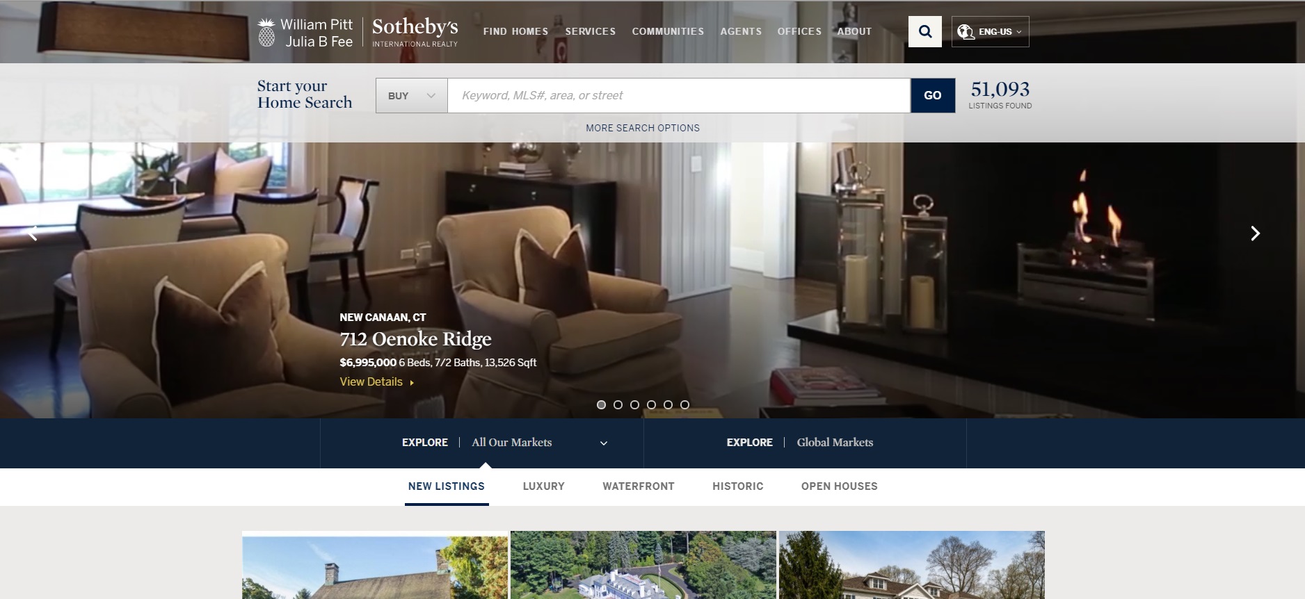
Congratulations to William Pitt and Julia B. Fee Sotheby’s Realty, 2016 Webby Honoree, Web – Real Estate
Landing on this real estate website feels like an episode of HGTV on mute. The camera pans around beautiful homes and gardens, and engages the user as if on an actual tour.