We launched our redesign of the GBF site in September of 2012, but it should be noted that, in addition to the site development, we created the logo and style guidelines.
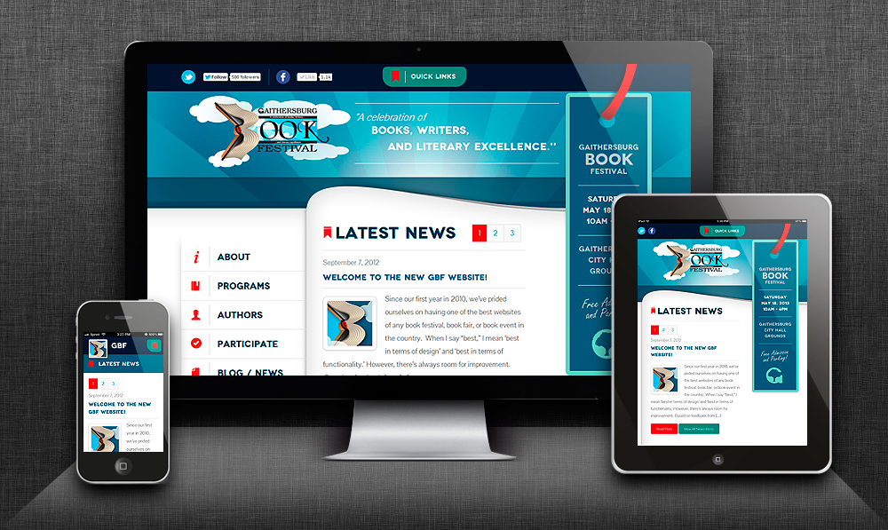
The GBF site is an example of responsive web design. That is to say, it is coded to reformat, on the fly, based on the size of the user’s browser window. This means that it in addition to the nice clean look and feel of the desktop site, it looks great on tablet and smart phone screens as well.
On the back end, there’s a sophisticated database engine, built to support posts, articles, author and book listings, pictures, video, and much more.
Please check it out at www.gaithersburgbookfestival.org.